Miami-Dade County Public Schools


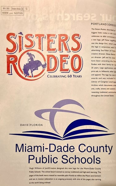
I saw the call for entries on a flyer taped to the art department door in December 2000. Miami-Dade County Public Schools was reaching out to the community in search of a new identity. My first instinct was to use a palm tree but it needed to combine seamlessly with an element of education. Through trial and error, I discovered the palm fronds could be arranged to mimic a book and its pages.
To imbue the design with deeper meaning, I envisioned the turning page as a symbol of educational progress. By setting that middle page in motion, it naturally began to evoke a planet. The moment that world took shape, the final piece of the puzzle clicked: an orbital path wrapped around it. This element introduced a high-tech dimension to the identity, drawing inspiration from how space exploration drives global technological advancement.
After entering the competition, I was notified the following month that marketing and advertising professionals from Miami's top ad agencies had judged the entry as the winning design.


A Miami Icon is Born
High Expectations
Announcing the winning design, then-Superintendent Roger Cuevas, stated in an official news release, “The new logo sets a tone of high expectations for our schools and students.” Beyond the public announcement, it was gratifying to have the district warmly embrace the work with Cuevas extending his personal appreciation in a letter. The design ultimately achieved what dozens of other prior proposals couldn't—finally breaking a long-standing school board deadlock to become the face of the district.
Validation
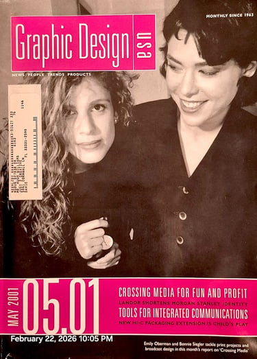
Not long after the creation of the logo I was contacted by Graphic Design USA requesting a write-up about the design. I had no idea where it might lead so it was a pleasant surprise to find it featured in their “Seen & Noted” section. Getting recognized nationally by a premier graphic design publication was the icing on the cake, validating the school board's decision and cementing the logo's place within the design community.
Adaptable
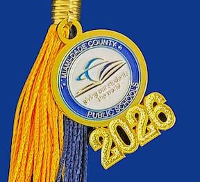
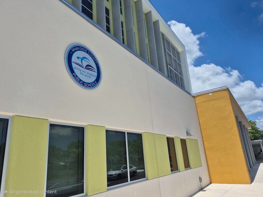
Since 2001, the logo has appeared in countless applications from—a pendant on a graduation tassel to 6-foot signage on school buildings. In 2007, a school board member suggested framing the logo within a circular emblem, establishing it as an official government seal. Over the year's it has been animated and enhanced as shown on the left.